本帖最后由 刘妍慧 于 2015-9-1 15:10 编辑
GRAPHICAL ANALYSIS AND HYPOTHESIS TESTS
Would You Survive a Voyage on the Titanic?
It happened more than 100 years ago, but the sinking of the Titanic still captures our attention. Less than half of the passengers survived her doomed maiden voyage—but the odds of surviving varied by gender and class.If you were a passenger, would you survive? Watch the video to see how easy this analysis is with Minitab 17 Statistical Software and the Assistant. Try It Yourself Use this data set and the Assistant in Minitab 17 to find out if you’d have lived to tell of the great ship’s sinking. Step 1: Seeing the DataA good first step with any data set is to visualize it with a graph. Minitab puts a wide array of graphing options at your fingertips. Select Assistant > Graphical Analysis… and choose the graph you need.
图形分析
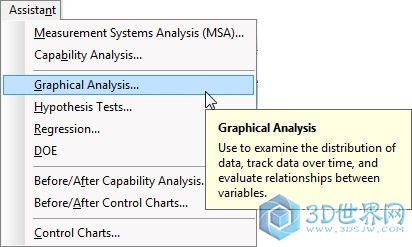
This data set contains counts for the number of Titanic passengers according to class and gender. A Pie Chart is a good choice for comparing data across these categories. Press the “Pie Chart” button and complete the dialog box as shown:
对话框
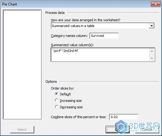
Minitab produces the following chart, which shows the percentage of survivors for each gender and class category:
图表

The Assistant also provides a table of detailed summary statistics:
总结表

The graph and summary statistics indicate that female passengers in first class had the best odds of surviving—fewer than 3 percent died, compared to 66 percent of first-class male passengers. Females fared better than males among second- and third-class passengers, too, with 61 percent surviving. Men without first-class tickets had the worst odds of making it off the ship: only 16 percent lived. Step 2. Verify It with a Hypothesis TestThe pie charts indicate that first-class female passengers were far more likely to survive than other travelers. But a graph could make it appear that groups are different when, statistically speaking, there is not enough evidence to support that conclusion. Graphs indicate what the data show; a hypothesis test can confirm it. Minitab provides a wide array of hypothesis tests. If you don’t know which to use, the Assistant can point you in the right direction. Choose Assistant > Hypothesis Tests...
假设测试
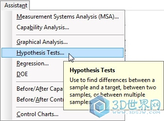
The Assistant presents three possible objectives for hypothesis tests.
假设测试1

Since the data divide passengers into four categories, the objective is to compare more than two samples. But which of the four available tests for comparing more than two samples is right? Click Help Me Choose for guidance.
假设测试2
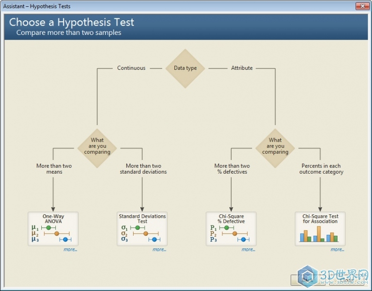
With attribute (or count) data, the Assistant directs you to either a chi-square % defective test or a chi-square test for association. To compare percentages in outcome categories, the chi-square test for association is appropriate. Select the appropriate columns to complete the dialog box as shown:
对话框2
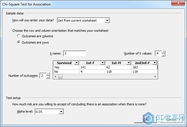
Press OK, and the Assistant produces a Report Card, a Diagnostic Report, and a Summary Report for the hypothesis test. The Summary Report presents the test results, including interpretation of those results. You don’t need a statistical background to understand the output from the Minitab Assistant:
报告测试结果

The Summary Report clearly states that “differences among the outcome percentage profiles are significant” across the four categories. The Percentage Profiles Chart shows the observed proportions of survivors, while the chart of % Difference between Observed and Expected Counts shows which groups had survival rates that were unexpectedly high…or low. If you were able to afford it, traveling first-class on the Titanic was definitely the way to go for both males and females! And if you were a woman with a first-class ticket, your chances of surviving were excellent. If you would have survived the Titanic, you would probably want to tell other people about it. To share this Assistant analysis with a friend, just right-click on the report in Minitab to send it to PowerPoint or Word. You’ve Survived!Now you’ve used Minitab and the Assistant to glean more insight into the Titanic data. How did you make out? Would you have lived—or were the odds on the Titanic stacked against you? Regardless of how you would fare on the Titanic, you have survived this data analysis, and you have seen how Minitab’s Assistant can help you visualize and confirm the significance of your results with a hypothesis test.
|